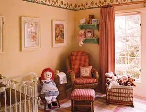
The moment you bring your newborn home, their room shifts from a guest space to a command center. Even if you plan to keep the crib in your own bedroom for the first few months, you will likely use the nursery for diaper changes, quiet reading, and the occasional nap. Getting it right early saves stress later. You need to feel at home there because you will spend a lot of hours there.
Furniture choices should prioritize comfort and longevity. A sturdy crib that meets current safety standards is non-negotiable. Add a cushioned rocking chair or an easy chair with good lumbar support. If you are nursing, include a footstool at a comfortable height for your legs. Don’t overlook a twin bed or daybed. It’s there for those long nights when baby is sick or fussy, and yes, your child will grow into it almost before you notice.
Safety First: The Changing Station
Many parents think any dresser or table works as a changing station. It doesn’t. The safest option is a conventional changing table with a built-in low rail. The rail needs to be at least a few inches higher than the pad to prevent rolling accidents.
If you must use an open-top dresser without rails, you have to install a securely anchored safety strap. Use it every single time. Babies beyond the newborn stage move faster than you expect. They have a knack for appearing on the edge of a surface before you can blink.
Look for a changing table with one or two open lower shelves. You need to grab wipes and diapers with one hand while keeping the other on the baby. Closed drawers are a pain; most wide drawers require two hands to pull evenly. If you stick with closed storage, plan to gather everything before you start the messy work.
Visual Development and Decor
Once the big furniture is in place, the rest is simple. If older siblings share the room, their needs will drive the layout. If it’s a solo nursery, you might be tempted to go all out with decor. Go for it, just avoid small parts and loose cords.
You don’t need to spend a fortune on special effects. Babies can’t see details or color nuances until they are about six months old. Until then, bold black-and-white patterns do the heavy lifting for eye and brain stimulation.
If your style is modern and lively, try black and white with red accents. If that’s not your vibe, rely on short-term toys and board books to stimulate the baby. Decorate the room in a way that suits your taste instead.
Themes and Color Psychology
Elaborate trompe l’oeil wall treatments featuring favorite characters are popular. Remember, babies and toddlers can’t appreciate the finer points yet. If your budget allows and your heart is set on nursery rhyme or fairy-tale images, indulge. You can enjoy them now, knowing your child will get the jokes when they hit preschool age. Just keep in mind that children up to age seven struggle to distinguish reality from imagination. Avoid scary images. The mood should be comforting, not disturbing.
Most color schemes work if you keep them on the clear, light side. Little ones generally dislike sophisticated gray tones. Dark shades make a typical small bedroom feel smaller and darker. Light, cheerful tints like mint green, yellow, and timeless white keep the space fresh and personal.
Babies can’t really see details or pick out the nuances of color until they’re six months old or so.
Exploring Nursery Styles
The following ideas explore how pattern and color define a nursery’s mood:
- Pattern Play : Different patterns affect the mood. Get ideas for special patterns that make the room unique.
- Color Play : Color schemes are essential for a fun, comfortable space. Find out which colors fit your baby’s room.
- Minty Fresh : One color can go a long way. See how green freshens up a nursery.
- Forecast: Sunshine : Sunny days are always happy days. Learn how to make the room the perfect forecast year-round.
- A Warm Welcome : Warm hues create coziness. Warm up the space with reds, oranges, and yellows.
- Engaging Enchantment : Let imagination run wild. Learn how to integrate home architecture with a nursery theme.
- All in Fun : Cheerful colors brighten a room. Find simple ways to make the space fun.
- Sweet Sentiments : Vintage looks never go out of style. See how antiques add sentiment.
- One of a Kind : Your baby’s room should be unique. Discover how small touches create special moments.
- Curiouser and Curiouser : Alice in Wonderland is a childhood favorite. Get curious ideas inspired by the tale.
On the next page, details on pattern in an Asian-inspired nursery follow.
Pattern Play Baby Nursery Decorating Idea
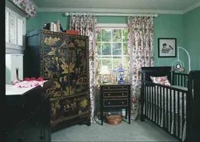

Stop thinking small. When you are brainstorming baby nursery decorating ideas, pattern play isn’t just a suggestion. It’s a necessity for creating depth.
Take this room, for example. It is a visual feast. The inspiration? Treasures from the Far East. But it isn’t cluttered. It is curated.
The focal point demands attention. A lacquered, gilded armoire. The kind with elaborate scenes painted on it. It is an antique reproduction, so you don’t need to hunt through estate sales for a fragile original. The key here is scale. It is boldly overscaled for a standard children’s bedroom. That is the trick. A large piece like this delivers drama. It anchors the room. And because it is a classic style, it won’t look outgrown when the child is twelve.
Black Lacquer and Aqua Tones
The furniture matches the mood. Black lacquered pieces. They are sculpturally handsome. Not just functional. They have lines.
But black can feel cold. Severely formal. So, what keeps it from looking like a lawyer’s office? The walls. And the floor.
They are covered in an aqua tint. A fresh, light blue-green. It softens the harshness of the black wood. It adds airiness.
Then there are the fabrics. Asian-inspired patterns. Bright, clear colors. All set against white backgrounds. This combination creates a lighthearted air. It feels fresh. Not heavy.
How to Balance Dark Furniture in Small Spaces
You might be worried about the black furniture making the room feel cramped. It is a valid concern. But the aqua walls do the heavy lifting here. Lighter wall colors reflect light, making the space feel larger than it is. The dark furniture becomes a striking contrast rather than a burden.
Consider the materials. Lacquer is durable. It wipes clean. Important for a nursery. You will need to clean spills. Lots of them. A high-gloss finish also reflects more light, further enhancing that sense of openness.
Where to Source Asian-Inspired Decor
You do not need a budget for antiques. The armoire mentioned is a reproduction. Look for modern manufacturers who offer lacquered finishes. The aesthetic is what matters, not the age of the piece.
For the fabrics, look for cotton blends with bold prints. The white background is key. It keeps the bright colors from clashing. It lets each pattern breathe.
Color schemes matter. But so does texture. The smooth lacquer against soft cotton bedding creates a tactile variety. It keeps the room interesting to the touch, not just the eye.
Which Color Palette Works Best for Asian Themes
Aqua is just one option. But it works well with the black and white base. It acts as a bridge. Between the dark wood and the white walls.
Other options might include deep reds or golds. But those can feel heavy. Aqua feels lighter. More appropriate for a baby’s room. It is calming.
The goal is a balance. Drama from the large furniture. Softness from the walls and textiles. If you get the pattern play right, the room will feel designed. Not accidental.
Keep looking at the next page for more on enticing color schemes.
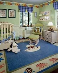

Color choices matter more than you think when designing a nursery. Two themes dominate the space for little boys: animals and vehicles. They work because they blend familiar concepts with designer flair and bold palettes.
Take the Noah’s Ark theme. It starts with fresh apple green and medium blue. Then it punches up with red and warm hues. The result is energetic.
Another approach uses sunny yellow. Stripes and checks create a cheerful backdrop. Planes, cars, and trucks pop in green and red. Add a multicolor crib ensemble. Add upholstered mini wing chairs. The charm multiplies.
Whether your boy is rambunctious or studious, a clever design sparks imagination. Pick a motif he loves. Build from there.
Minty Fresh Baby Nursery Decorating Idea
Green offers a fresh alternative to the usual primaries. It feels calm yet vibrant. Consider earth tones or mint shades for walls. Pair them with crisp whites. This keeps the room airy.
Look for animal prints in muted greens. Think safari themes. Or stick to vehicles in olive and forest shades.
Safety comes first. Anchor heavy furniture to walls. Use low-VOC paint. Choose non-toxic fabrics.
Start with a green motif. It can brighten a baby’s room without overwhelming the senses.
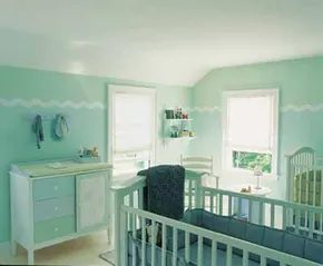

Green is the color of growth. It works everywhere for kids. Especially in a nursery.
Pair it with pink and white for girls. You get a garden vibe. Easy.
Group it with blue and white for boys. This setup acts like a refreshing preserve. Cool. Calm.
The walls here feature hand-painted stylized waves. Add bubbly circles. Combine with playful contemporary furniture. The result is simple. It pleases.
Choosing the Right Tints
You can swap the green for almost any pastel tint. The key is selection.
Use analogous colors. These are closely allied tints. They flow. They don’t chop.
Direction matters too.
- South or West-facing room: Use cool tints. Green. Blue. Periwinkle. Blue-violet.
- North or East-facing room: Try warm tints. Peach. Coral. Pink. Sunshine yellow.
Forecast: Sunshine Baby Nursery Decorating Idea
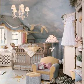

You don’t need to default to standard nursery clichés to create a soothing space. This room proves that a confident eye for color and a sure hand with fabrics can turn a sunny forecast into a precious baby nursery decorating idea. The result is wonderfully clever rather than just pretty.
Most designers suggest a faux finish to mimic a blue sky with white clouds. It’s cute. It’s safe. But this space goes beyond cute to captivating. The trick? A trio of flying geese. One is dressed as Mother Goose. It’s specific. It’s storytelling. It avoids the generic.
Art Furniture and Textile Details
A nicely shaped easy chair and ottoman are standard comfort items. Here, they become art furniture. How? Through various cheery fabrics and contrasting piping. The materials matter. The contrast creates depth.
Even a simple white lamp shade gets a perky outlook with glued-on pink pompons. Small details shift the entire vibe. They add texture where flat surfaces usually dominate.
This room was born with a sunny disposition that brings warmth to your baby’s nursery.
The hand-painted golden motif on floor and pillows says it all. It anchors the whimsy. It grounds the playfulness. Without it, the geese might feel floating and unmoored. With it, the space feels intentional.
Why Warm Colors Work
Decorating with warm colors in a nursery isn’t just about energy. It’s about warmth. Literal and emotional. The golden motifs reflect light. The pink accents soften the edges. The blue sky backdrop (implied or painted) provides calm.
The combination creates a space that feels lived-in, even before the baby arrives. It’s not sterile. It’s not overly stimulating. It’s balanced.
Practical Steps for Your Own Space
If you’re tempted to replicate this look, start with the walls. A faux finish is accessible for DIYers. Use a sponge or a rag for texture. Blend light blue with white for clouds. Keep it soft. Avoid harsh lines.
Next, tackle the seating. Buy a basic upholstered chair. Replace the fabric if needed. Choose a cheerful pattern. Add contrasting piping for that “art furniture” feel. You can buy piping pre-made or make your own from fabric scraps.
The lamp shade is an easy win. Glue on pompons. Use craft glue. Let it dry completely. Choose a pink that complements your palette. Too bright and it clashes. Too pale and it disappears.
Finally, the hand-painted details. You don’t need to be an artist. Use stencils. Or freehand simple shapes. Golden motifs on the floor can be done with paint markers for precision. On pillows, use fabric paint. It washes better.
Safety first. Ensure all paints are non-toxic. Secure furniture to the wall. Keep small decor items out of reach. The pompons on the lamp shade should be glued securely. Loose parts are a choking hazard.
Which Approach Fits Your Skill Level?
- Low Skill : Use pre-made cloud stencils for the wall. Buy a ready-upholstered chair with contrasting trim. Add pompons to a lamp.
- Medium Skill : Mix your own faux finish. Reupholster the chair with your chosen fabric. Hand-paint simple motifs
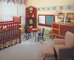

Warm tones work hard to create a welcoming vibe in a baby’s room. Kids pick up on warmth fast. Even a newborn responds to red. You might hesitate to paint four walls in fire-engine crimson. That’s a lot of pigment.
Instead, try rich alternatives.
Coral. Cranberry. Barn red. Ruby hues. These shades feel exciting without being overwhelming. They bring a cozy energy to the space.
Balancing red is the real trick. Too much red overwhelms a small room. Keep it manageable with strategy.
Balancing Act: Walls and Furniture
If you go with red walls, pull back elsewhere.
- Keep the ceiling white.
- Choose light-colored floors.
- Select cool-toned furniture.
- Add pale blue or light green accents.
White, cream, and pale blue add serenity. They offset red’s stimulation. The result is calm.
If you prefer red furniture instead, the room feels softer. Red covers less surface area. You can use warm tints on the walls.
Try yellow. Pink. Peach. Melon. These colors continue the warming trend gently. They don’t scream for attention. They invite relaxation.
The key to using red effectively is contrast. Cool, light elements balance the visual weight of warm, bold hues.
Integrating Architecture
Color is only one layer. Your home’s unique architecture plays a role too.
The next section explores blending your nursery theme with existing structural elements. Think about windows, doors, and built-ins. How do they fit the mood?
This approach moves beyond just painting walls. It’s about making the room feel like part of the house, not a separate box.
Engage with the space. Let the architecture guide the decor. That’s where true enchantment happens.

How to Tame Vintage Windows in a Nursery
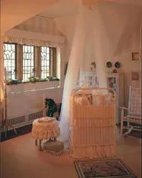
Lead glass isn’t just for churches. It can make a nursery feel like a storybook. But when those old windows have specific imagery, you have to work with them, not against them.
Take a house with serious architectural history. The goal was simple: build a child-friendly space without erasing the drama of the original structure. One window featured a leaping bunny. That works for a nursery. Easy. The other window? It showed cats and a pumpkin.
Problem.
In October, sure. In April? It looks like a Halloween haunted house. You don’t want that lingering spooky vibe in a baby’s room. The solution wasn’t to cover the glass. It was to change the context.
The Mother Goose Garden Theme
The designer landed on a Mother Goose garden concept. It’s a flexible theme. It allows for animals. It allows for plants. It bridges the gap between the historic leaded glass and a modern, soft nursery aesthetic.
Suddenly, the pumpkin on the window isn’t a Halloween decoration. It’s part of the garden. The cats? They’re just neighbors in the rhyme. The theme pulled in cows jumping over the moon. Cabbages. A rocking horse. The old storytelling fowl herself.
It tied everything together.
Balancing Light and Dark
Victorian interiors often feel heavy. Dark wood. Heavy fabrics. To keep this nursery from feeling like a museum exhibit, the palette needed to lighten up.
Lots of white.
Pastel tints.
These soft colors bounce off the historic dark wood tones. The contrast is what gives the room its character. It’s a lightened-up Victorian-style nursery. It looks historically rich. But it also feels delicate. Fresh. Fun.
Antique artworks on the walls help anchor the space. They remind you that the house has a past. The white trim and pastel accents remind you that the child has a present.
Practical Takeaways for Your DIY Project
You don’t need a designer to pull this off. You just need a plan for the windows.
- Assess the Glass. Look at what’s already there. Is it abstract? Good. Is it specific? Like a witch or a pumpkin? You need a counter-theme.
- Pick a Narrative. If the window has a pumpkin, don’t fight it with a plain white wall. Add cabbages. Add vines. Make the pumpkin part of a larger story.
- Lighten the Palette. If your home has dark wood floors or trim (like many older homes), keep walls white or very pale blue/pink. Let the furniture provide the dark accents.
- Use Antique Pieces. A vintage rocking horse or an old print fits naturally in a historic home. It doesn’t fight the architecture; it complements it.
The result is a room that feels timeless. It honors the leaded glass. It respects the house’s age. But it’s clearly a nursery.
There are always more ideas. The next page offers even more fun decorating ideas for your baby’s nursery.
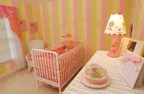

Color hits harder than any other design choice. It sets the mood instantly. If you want a happy space, pick bright, cheerful hues. It’s not complicated. In fact, for a baby’s room, simplicity is usually the win.
This specific setup leans on wide, bold stripes. The colors are sherbet tints. You get a circus vibe mixed with a spring garden. It’s fun. It’s pretty. But it avoids the trap of being overly saccharine.
Avoiding the Floral Trap
To keep the room from feeling too sweet or cliché, skip the conventional floral prints. They are everywhere. Instead, go for whimsical farm animals. Add some checks. It creates a frisky air. The pattern is distinct. It feels fresh rather than dated.
The furniture choice matters just as much as the paint. White wicker pieces are a smart move. They bring their own woven texture to the mix. It adds subtle interest without competing with the bold walls.
White wicker furniture retains its charm long after the crib is gone.
Think about longevity. Baby stages move fast. The crib will disappear. The wicker dresser or chair? It stays. It transitions from nursery to toddler room without looking out of place.
Practical Details for the DIY Homeowner
If you’re tackling this yourself, start with the wall. Measure carefully. Wide stripes require precision. Tape it off. Use a laser level if you have one. It keeps the lines straight.
For the accents, look for second-hand wicker pieces. They often have character. Sand them down if needed. A fresh coat of white paint ties it all together.
When picking the farm animal decor, look for texture. Wood toys. Canvas prints. Avoid plastic if you can. It feels cheaper. The goal is a space that feels intentional, not just filled with stuff.
The next set of ideas focuses on sentiment. How to add personal touches. How to make the room feel like yours. Not just a catalog display.
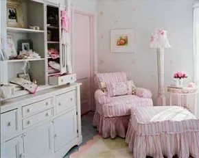

Sentimental charm works because it feels personal. It’s not just decoration. It’s a feeling. Think of a faded photograph from the early 1900s. Soft. Tinted. Warm.
This room captures that vibe for a modern baby girl. It looks old-timey. But it isn’t a museum exhibit. You can actually live in it.
The trick? Practicality.
Practical Vintage Aesthetics
The foundation is white furniture. Think vintage pieces. Crisp. Clean.
Layer it with fabrics. Washable cotton. That’s non-negotiable for a nursery. Stains happen. Spills happen. You need to be able to toss things in the machine without panic.
Add ruffles. Gently ruffled curtains or quilt edges. They soften the lines. They make the space feel feminine without being overly girly.
Floral Focus
Flowers drive the theme. Tea roses are the classic choice. They appear everywhere.
- Print fabrics
- Appliqués on clothes
- Framed wall art
Keep it simple. A single rose in a cheap frame works. You don’t need expensive art.
Roses fit the pink-and-white color scheme naturally. But they aren’t mandatory.
Alternatives to Roses
If roses feel too cliché, switch it up. The goal is uniqueness. Your baby’s room should reflect your baby.
Consider these options:
- White violets
- Tiny blue forget-me-nots
- Pansies in soft yellow or purple
The colors stay in the pastel range. White. Blue. Yellow. Purple. It’s still soft. It’s still calm. But it’s different.
This approach keeps the room from looking generic. It stops it from being just another catalog sample.
Building a Unique Space
The next steps involve sourcing and assembly. You need specific materials. And you need to assemble them with care.
Details matter here. The difference between “cute” and “cluttered” is often in the accessories. Don’t overdo it. Let the furniture and the fabric breathe.
Sourcing Vintage Furniture
Find white furniture. Thrift stores. Estate sales. Online marketplaces. Look for solid wood. Avoid particle board. Solid wood lasts. It can be refinished if needed.
White paint hides wear. But it also shows dirt. You’ll be cleaning it often.
Fabric Choices
Stick to cotton. Linen blends work too. Avoid synthetics. They don’t breathe. They trap heat. Babies need cool air.
Ruffles add texture. But too many ruffles look fussy. Pick one or two items. A crib sheet. A valance. Not everything.
Wall Art
Frame the flowers. Simple frames. White or light wood. Let the image stand out. Don’t frame busy patterns. Keep the background plain.
Color Palette Consistency
If you swap roses for violets, keep the colors consistent. White background. Soft purple flowers. No bright neon accents.
The vibe is muted. Calm. Sleep-friendly.
Avoiding the “Museum” Trap
The danger with vintage styles is making it look sterile. Or too formal.
Break the rules. Throw a modern blanket on the chair. Use a contemporary

Curiouser and Curiouser Baby Nursery Decorating Idea
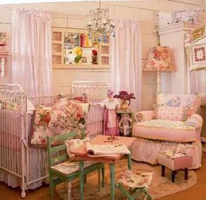
Three sisters. Three wildly different aesthetics. One shared palette: pink.
It is a classic color for a reason. It works. But the execution? That is where the magic happens. Each room features a standout crib and an armchair with rolled arms for late-night reading sessions. Beyond that, the styles diverge completely.
One leans into exuberant romance. The second is sweet, soothing, and traditional. The third mixes nostalgic charm with a funky vintage vibe. You do not need to buy a matching set from a big-box store. Unique finds create a better story.
Curiouser and Curiouser Baby Nursery Decorating Idea
This room draws inspiration from Alice in Wonderland. It is not about copying the book exactly. It is about capturing the whimsy.
Start with the walls. A soft, pale pink sets the base. It is gentle on the eyes. Add texture with wallpaper that has subtle patterns. Think florals or subtle geometric shapes. Avoid loud, busy prints. They overwhelm the space.
The crib is the focal point. Choose one with clean lines. White or light wood works best here. It keeps the room airy. Drape a canopy if you want extra dreaminess. Use sheer fabric. It adds movement without closing off the space.
The Chair and Accessories
The rolled-arm chair is non-negotiable. Pick a fabric that is durable. You will be sitting in that chair a lot. Velvet is luxurious but show stains easily. Cotton blends are practical. They hold up to spills and wear.
Add accents sparingly. A few framed illustrations of rabbits or tea cups. Do not overdo it. The goal is subtle whimsy. Not a costume party.
Centering Decor Around Childhood Stories
You do not need a theme to make a room special. Stories work better.
Think about your daughter’s future. What will she love? Books? Nature? Art? Let that guide your choices.
Start with a neutral base. White walls. Light wood floors. This gives you room to change things later. Add personality through textiles. A rug with a map pattern. Pillows with literary quotes.
The crib should be simple. Let the bedding tell the story. A quilt with a patchwork design adds warmth. It feels handmade. Even if you buy it.
Nostalgic Charm Meets Funky Vintage
This approach is for parents who love the past. But not in a dusty way. In a fun, eclectic way.
Mix eras. A mid-century modern crib paired with a shabby chic dresser. It creates tension. And that tension is interesting.
Pink is still there. But it is used as an accent. A rug in dusty rose. Curtains in a muted blush. Avoid hot pink. It dates quickly. Muted tones age gracefully.
Tools and Materials for the Vintage Look
You need specific materials for this style. Distressed wood is key. Look for furniture with character. Scratches are okay. They add history.
Paint can help. Use chalk paint for a matte finish. It sands easily. You can distress it yourself. Sand the edges. Reveal the wood underneath.
For the walls, consider wallpaper with a vintage print. Floral patterns work well. Or stripes. Vertical stripes make the ceiling feel higher.
Timelessly Traditional and So
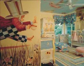

The classic tale of Alice in Wonderland isn’t just a bedtime read. It’s a masterclass in visual design for a baby’s first space. The whimsical, slightly edgy aesthetic of Lewis Carroll’s Victorian world translates perfectly into a nursery that stimulates a newborn’s developing eyes.
Think about it. Newborns see best in high-contrast black and white. They have poor color vision at birth and struggle to focus on blurry, pastel-heavy environments. A room filled with crisp graphics, bold stripes, and distinct shapes provides the visual stimulation a baby actually craves right now.
Visual Stimulation and Pattern Mixing
You don’t need to hire a professional muralist to get this effect. The key is mixing patterns with intention. Start with a base. An ethereal blue ground sets a calming stage. On top of that, layer prints that have clear boundaries.
Consider these elements:
- Crayon-box stripes: Vertical or horizontal lines are easy for a baby’s eyes to track.
- Checkerboard patterns: High-contrast grids help develop depth perception.
- Gingham checks: The repeating square pattern offers rhythm and predictability.
- Pin dots: Small, sharp dots provide texture without overwhelming the visual field.
- Floral prints: Use these sparingly as accents to break up the geometric rigidity.
The Cheshire Cat, the White Rabbit, and the Mad Hatter can be introduced later. For now, the geometry is what matters. The black-and-white accents appeal to the infant’s limited color spectrum. The sophisticated mix of prints is something you will love as the child grows.
DIY Application for the Home
This look is accessible for a DIY homeowner. You don’t need to hand-paint every character to capture the spirit.
Painting: If you’re comfortable with brushes, hand-painted scenes add authenticity. But it’s not a requirement. The color play works on its own.
Textiles: Swap out solid-color bedding for patterned sheets. Use gingham for the crib sheet. Add a checkerboard throw pillow. Mix a floral quilt with the geometric patterns. The combination feels curated, not chaotic.
Walls: Paint one wall a solid, soft blue. Leave the others white or light gray. Hang framed prints of classic illustrations. This creates focal points without overwhelming the space.
Why This Works for Comfort
A nursery is more than decoration. It’s a sanctuary. The visual noise of mixed patterns might seem intense, but the underlying color palette—soft blues, crisp whites, and bold blacks—keeps the energy balanced. It’s lively but not frantic.
This approach creates a space that welcomes the new family member. It nurtures through sight. And it gives parents a room that feels personal and creative, rather than generic.
The sophisticated mix of prints is one parents will love. The high-contrast elements are one a baby will notice.
You can adjust the intensity as the child grows. Add color slowly. Introduce more complex themes. But start with what the baby can see. Start with what works.